Preparing a layout can take me hours, especially when I have to do extraction. I noticed lately that I have been taking a lot of short cuts, like using templates, steering away from extraction... etc. I make layouts for the sake of finishing one because simply submitting a layout qualifies me for the challenge incentive.
Dear, CSD... I miss your friendly contests.
I am not very satisfied with my recent layouts. I am running out of fresh ideas.
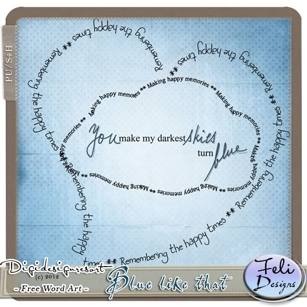
Anyway, I was preparing a layout for Digidesignresort's Wordart Challenge for June a few days ago. The challenge is to use your own handwriting OR a text path in the layout. We can make our own or use this lovely set provided by Feli Designs:
I wanted to customize the text so I tried to make my own text path. Since it was my first try, it needed a lot of fine-tuning, meaning a lot of time I do not have right now, so I decided to go with a text path template I got from DigiOD.
Here's the layout I managed to finish.
 |
| Elements from: Silent Atoll kit by A-liya; Text path template from: DigiOD |
Looking at it now for the second time, I guess it's not so bad. But a few days ago after I finished it, and after looking at other people's submissions for the challenge, I wasn't so happy with it. So I tried again. And this time, I used one of the wordart provided for the challenge:
 |
| Elements from: Une Lumiere dans la brum Add-on by Annliz; Wordart from: Feli Designs |
I like the second layout better because it's simpler, and looks "cleaner". I guess this is the problem I have with clustering. It always makes me feel that the page is too cluttered, which tells me I must be doing something wrong because I have seen some clusters that take up most of the page but still look beautiful.
Anyway, both photos were taken at the mall. They had this exhibit of ocean animal plush toys in the garden outside. The first time I took Andrea, she was so scared for the big toy animals that she cried everytime we went near. The second time was better and she was the one who asked me to take her photo before running off to pose in front of the turtles :)


4 comments:
Well, Janelle, I think both of your layouts are quite lovely. The only constructive comment I can make is to not overlay the 'e' on the first one. But I am impressed by your text path (I still haven't figured out properly how to do this!!) and your overall designs are very pretty :o)
All your layouts are really nice and creative.. I loved this text path thing.
I would love to do some digiscrapping too but no time......do some for me too janelle ;)
i enjoyed my visit to your blog today with your cute pictures and great layouts. i think both of them are great!
Hi Janelle! I love the second layout. Mukha ng "big girl" si Andrea! At mukhang magiging "long legged legs" sha ha winnur ang miss universe legs !
Post a Comment